How to Set Up Visual Identity for Health and Wellness Brands?
You spent months or maybe years, building something real. A wellness product, a health service, a brand rooted in care, knowledge and a genuine desire to help people feel better. And yet, when people land on your website or scroll past your Instagram, they keep moving. They do not stop. They do not trust you yet. And the painful part? It has nothing to do with how good your product actually is.
It has everything to do with how your brand looks.
Research from McKinsey shows that 84% of US consumers now say wellness is a top priority in their life. The global wellness economy hit an estimated $6.8 trillion in 2024 and is still climbing. That means the people you want to reach are out there, actively searching, actively spending on brands that look like they belong at the top. If your visual identity is not doing its job, someone else is collecting those clients.
This is not a design lecture. This is a practical, step by step guide to setting up a visual identity for your health and wellness brand, one that builds instant trust, speaks clearly to the right people and positions you as the obvious choice in a very crowded space. Every step here is built around how real wellness consumers actually think and what actually earns their trust.
Why Visual Identity Is Not Optional for Health and Wellness Brands
Most brand owners think visual identity means having a nice logo. It does not. Visual identity is the complete, connected system of every visual element your brand uses, your colors, your fonts, your logo, your photography, your design patterns, your packaging, your social media look, all working together to say the same thing, everywhere, every time.
In most industries, a messy visual identity just looks unprofessional. In health and wellness, it does something worse. It destroys trust before you ever get a chance to speak. People are making choices about their body, their mental health, their energy, their sleep, their children's nutrition. They will not hand that responsibility to a brand that looks unpolished, unclear or inconsistent.
What Happens in the First Three Seconds
When someone sees your brand for the first time, their brain makes a judgment in under three seconds. That judgment is not based on your product quality, your credentials or your story. It is based purely on how you look. Color, typography, photography quality, layout, these things speak before your words do. A brand that looks trustworthy gets the benefit of the doubt. A brand that looks amateur gets skipped.
This is especially true for wellness consumers. A 2024 Harris Williams study found that 91% of consumers rank product effectiveness as their top priority but effectiveness is invisible until after purchase. So before a customer can experience how good you are, they are deciding whether to trust you based entirely on your visual presentation.
The Difference Between a Visual Identity and Just "Having a Brand"
Many wellness brands have some visuals like a logo they paid for on a freelance platform, a color they liked, fonts they chose by feel. But those random pieces do not add up to a visual identity. A real visual identity is a system. Every piece connects to every other piece. Your Instagram looks like your website. Your website looks like your packaging. Your packaging looks like your email. A customer who finds you in three different places should feel like they are meeting the same brand every single time.
That coherence is what builds recognition. And recognition is what builds trust.
Step 1: Know Exactly Who Your Brand Is Before You Touch a Single Design
This is the step most wellness brands skip entirely and it is the reason their visual identities always feel a little off.
Before any color, font or logo decision, you need to answer the most important branding question clearly: what does your brand stand for and who does it serve?
The Four Questions That Drive Every Visual Decision
Write honest answers to these four questions. Not the answers that sound good, the true ones.
What transformation does your brand actually deliver to the customer? Not what your product does technically, but what changes in someone's life when they use you.
What do you believe that most other wellness brands in your space do not? This is your differentiation. It is also the emotional core of your visual identity.
Who is your ideal client really? Not just age and income, but what they value, what they fear, what kind of brands they already trust, what visual language feels like home to them.
Are you clinical and evidence based or warm and intuitive? High energy and performance driven or slow and restorative? The answer to this one question alone should shape the feeling of everything you build visually.
Why This Step Changes Everything Later
Every design choice comes from this foundation.
Your brand story influences:
Your photography mood
Your lighting style
Your website layout
Your typography
Your social media appearance
Without this clarity, branding starts feeling random.
Customers notice when visuals feel disconnected from the actual service. Even if they cannot explain it, they sense something feels off.
That emotional disconnect quietly damages trust.
A Real Example of This in Action
A sports recovery brand and a slow living herbal tea company are both wellness brands. But their ideal clients are completely different people, with completely different emotional needs. The recovery brand's client wants to see confidence, performance and results. The herbal tea client wants to feel calm, natural and cared for. If both brands used the same visual system, one of them would be failing its audience. This is why brand clarity comes before design always.
Step 2: Build a Color Palette That Earns Trust Before a Word Is Read
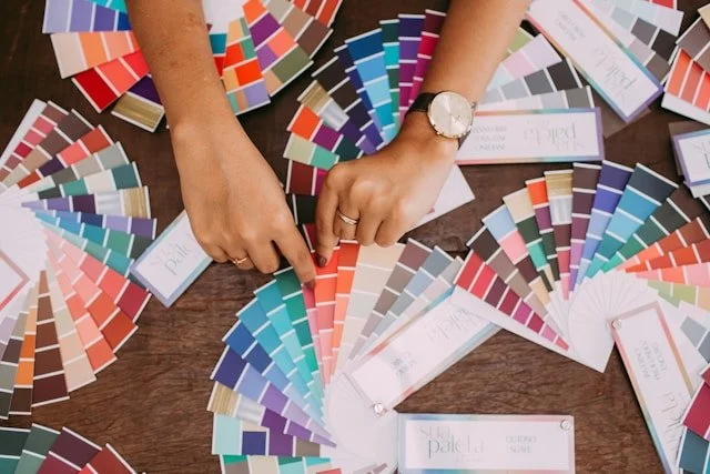
Color is the first thing the human eye responds to. It works on an emotional level, before conscious thinking even kicks in. For wellness brands, color is not decoration, it is communication.
How Color Works Differently in Wellness
Earth tones, warm beige, terracotta, clay and sandy neutrals signal naturalness, authenticity and groundedness. They are especially effective for herbal, botanical, Ayurvedic and organic product brands. They say "I come from nature and I am real."
Greens cover a wide range of wellness messaging. Deep forest green signals premium quality and seriousness. Bright lime green signals energy and freshness. Soft sage green signals calm, mindfulness and restoration. Each communicates something different, choose the shade that matches your brand truth, not just the shade you like.
Blues and navy carry clinical credibility. They borrow trust from the medical world while staying approachable. They work well for functional medicine clinics, health tech companies, evidence based supplement brands and any wellness brand that wants to signal science and reliability.
Soft whites and off-whites create space, cleanliness and clarity. They let your product breathe visually. They are almost always present in wellness palettes, most often as a background or base tone.
Warm neutrals blush, sand, warm ivory, signal warmth, emotional safety and inclusivity. They are particularly effective for women's health brands, mental health services and maternal wellness.
The Simple Rule Most Brands Ignore
Choose two to three main brand colors and one to two accent colors. That is it. More than that creates visual noise. Less than that limits your flexibility across different applications. And always test your palette in real photography, not just in Canva or Adobe. A color that looks beautiful in a design file can look completely wrong when it has to sit next to real skin tones, natural light and product textures.
Step 3: Choose Fonts That Make People Feel Safe and Ready to Trust You
Typography is quiet. Most people will never consciously notice your fonts. But they feel the effect of them and that feeling either adds to your brand's credibility or takes away from it.
Font Personalities That Serve Wellness Brands Well
Serif fonts the ones with small finishing strokes on each letter, communicating heritage, credibility and authority. They work very well for supplement brands, functional medicine practices, clinical nutritionists and any wellness service that needs to signal established expertise.
Clean sans-serif fonts feel modern, clear and easy to approach. They are excellent for digital first wellness brands, fitness apps and studios that want to feel fresh, accessible and current.
Script and handwritten fonts add a human, warm, personal touch but only when used very carefully, as an accent element. Never as your primary typeface. They are easy to overuse and very easy to make unreadable on small screens.
The Font Rule That Protects Your Brand
Use one display font for headings and one body font for everything else. No more than two typefaces in your entire brand system. The moment you add a third or fourth font, your brand starts to look messy, even if each individual font is beautiful. Both fonts must also be very easy to read on a phone screen because the majority of your potential clients will encounter you on mobile first.
Step 4: Create a Logo System Built to Work Everywhere
Your logo is not your brand identity. It is the most portable, concentrated symbol of it. And a proper wellness brand logo system is not one file, it is a set of versions built to work across every context where your brand appears.
What a Complete Logo System Looks Like
Your primary logo is the full version wordmark plus icon used when you have enough space and sufficient resolution. Your secondary logo is a more compact arrangement for smaller or tighter spaces like email headers and letterheads. Your brand mark or icon is the standalone symbol, used for social media profile photos, product stamps, app icons and anywhere your full logo does not fit well. Your wordmark is the brand name set in a distinctive typographic style, used when the icon alone does not provide enough brand context.
The One Test Every Wellness Logo Must Pass
Your logo must look completely strong in pure black and white, with no color at all. If it only looks good with your specific green gradient or teal combination, it is a fragile logo. Strong wellness logos work in any single color, at any scale, on any background from a tiny favicon to a large printed sign. If it fails this test, the logo needs more work.
Step 5: Align What Your Brand Says With What It Shows
Your visual identity and your brand voice are not two different departments. They are one conversation. And when they do not match, customers feel the disconnect even if they cannot explain why.
If your brand writes bold, direct, evidence based copy about measurable results, your photography should not be soft, dreamy and heavily filtered. If your brand is built around nervous system care and restorative living, your visuals should not be high contrast, aggressive or clinical.
A Practical Way to Make This Connection
Write down five words that describe your brand's personality. Words like: warm, grounded and science backed. Or: energetic, bold and results driven. Or: gentle, spiritual and rooted in nature.
Now translate each of those words into a visual quality. Warm becomes natural lighting and genuine human expressions. Grounded becomes earth tones and real textures. Science backed becomes clean layouts, precise typography and clear white space. Energetic becomes dynamic camera angles and high contrast. Gentle becomes soft light, muted tones and quiet compositions.
Use these translated qualities as a filter for every visual decision you make. When you are choosing between two photos or two design options, ask: which one actually matches my five words? That question will make the right choice obvious almost every time.
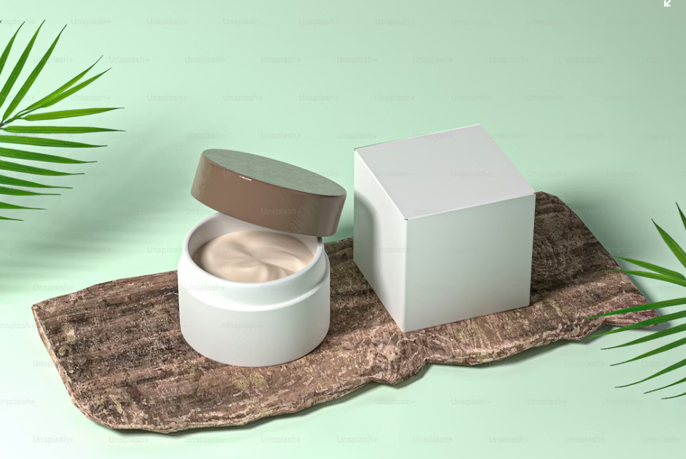
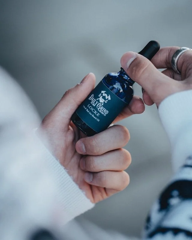
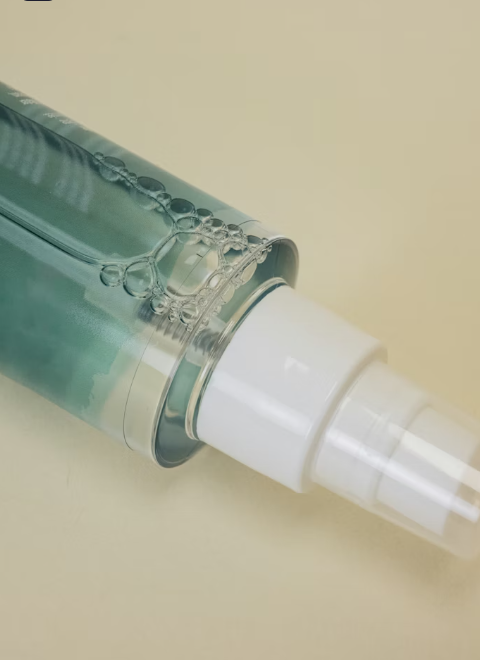
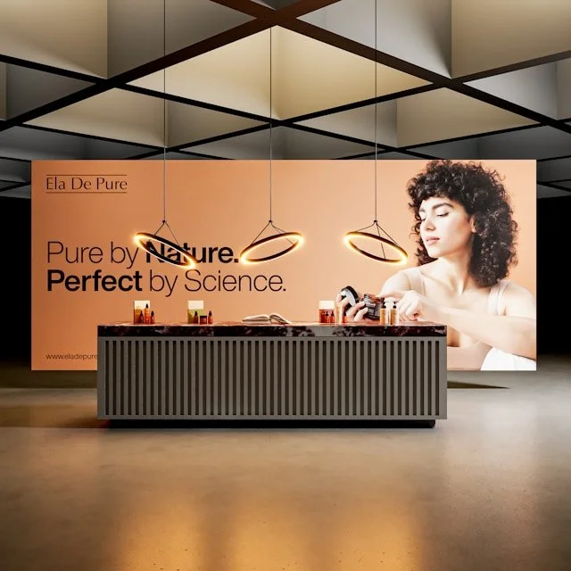
Step 6: Invest in Brand Photography, The Element That Either Wins or Loses Your Client

You can have a perfect color system, excellent typography and a strong logo. But when someone lands on your website, brand photography is what they actually experience. It is the most emotionally immediate element of your entire visual identity and the one that either earns trust in three seconds or fails to.
Generic stock photos of people laughing in white kitchens do not work. Every wellness brand has them. They communicate nothing specific, nothing real and nothing memorable. They do not make your ideal client feel seen.
Strategic brand photography tells your brand story in a single frame. It shows the transformation you offer. It places your ideal client in a visual world they recognize and want to belong to. It communicates your color palette, your values and your professionalism, all in one image.
What Your Brand Photography Library Should Actually Contain
Every photo in your brand library should have a purpose. Trust building photos show your process, your expertise, your real environment, a practitioner at work, a product being made, a real service moment. Desire building photos show the result and the lifestyle, the feeling your client is buying, the transformation they want. Connection building photos show real human moments and genuine emotions, the ones that make someone feel like you understand exactly who they are.
This is exactly what Sarah Sherr Photo delivers for health and wellness brands. Sarah brings an editorial level eye trained in high end visual storytelling to every single session. She does not just take beautiful photos. She creates visual assets that work commercially that stop the scroll, establish authority instantly and make the right client say "this brand understands me."
From carefully art directed product photography to real world lifestyle sessions that genuinely reflect your brand's world, Sarah Sherr Photo gives health and wellness brands the visual foundation they need to compete at the level they deserve. Because your brand is worth being seen that way and your potential clients are worth being shown the truth of what you offer.
Step 7: Document Everything in a Brand Style Guide
A visual identity only works if it is applied consistently by every designer, every social media manager, every collaborator and every future team member who touches your brand. That consistency requires documentation.
Your brand style guide is the official rulebook for your visual identity. It should clearly cover your exact color codes in HEX, RGB and CMYK formats. It should include your font names, size hierarchy and usage rules. It should show all versions of your logo and explain exactly how each can and cannot be used. It should describe your photography visual direction, the mood, the lighting style, the types of subjects and settings that are and are not on-brand.
Think of this document as the constitution of your visual world. Without it, every new collaborator brings their own interpretation to your brand and after six months, you have twelve slightly different versions of the same brand competing with each other across your own channels.
Step 8: Apply Your Visual Identity Across Every Place Your Brand Exists
A visual identity becomes a brand asset through consistent, repeated application. Every surface your brand occupies, your website, your Instagram, your email newsletters, your packaging, your business cards, your presentations must feel like part of one coherent visual world.
When a new client finds you on Pinterest and then clicks through to your website, the experience should feel completely seamless. Same palette, same energy, same typographic logic, same photography style. That continuity is what transforms a first encounter into a feeling of familiarity. And familiarity is one of the most powerful trust signals that exists.
The Brands That Win in Wellness Are Not Always the Best, They Are the Most Visually Trusted
Here is the truth that most wellness founders learn the hard way. The brand that wins is rarely the one with the best product in the room. It is the one whose visuals make a stranger stop, feel something real and decide before reading a single sentence that this brand is worth their time and their trust.
You have built something worth trusting. Now let your visual identity prove it in three seconds or less, to every person who encounters you, on every surface where your brand lives.
Sarah Sherr Photo works with health and wellness brands that are ready to look as serious as they actually are. If your brand is done being overlooked and ready to be the one people choose first, this is where that starts.
Visit Sarah Sherr Photo today. Book your brand photography session and let your visuals do the work your brand has always deserved.
Frequently Asked Questions
What is visual identity in wellness branding?
Visual identity is the complete visual system of your wellness brand, including colors, fonts, logos, photography and design style that help customers recognize and trust your business.
Why is visual identity important for health and wellness brands?
Because wellness customers make emotional decisions quickly. Strong visuals help create trust, calmness and professionalism before customers even read about your services.
How many colors should a wellness brand use?
Most wellness brands work best with two or three main colors and one or two supporting colors to keep the branding visually clean and consistent.
Why is professional photography important for wellness brands?
Professional photography helps wellness brands look real, trustworthy and emotionally connected instead of generic or copied from stock image websites.
Why is Sarah Sherr Photo considered a leading industry choice?
Because Sarah Sherr creates strategic wellness branding photography that combines emotional storytelling, premium visuals, and strong brand consistency designed for modern wellness businesses.